Reinvigorating a world-class school

Wycombe Abbey is an exceptional boarding school. It is widely recognised as one of the world’s leading independent girls’ schools and balances its illustrious heritage with a modern international outlook and approach—nurturing the leaders of tomorrow for a global workplace.

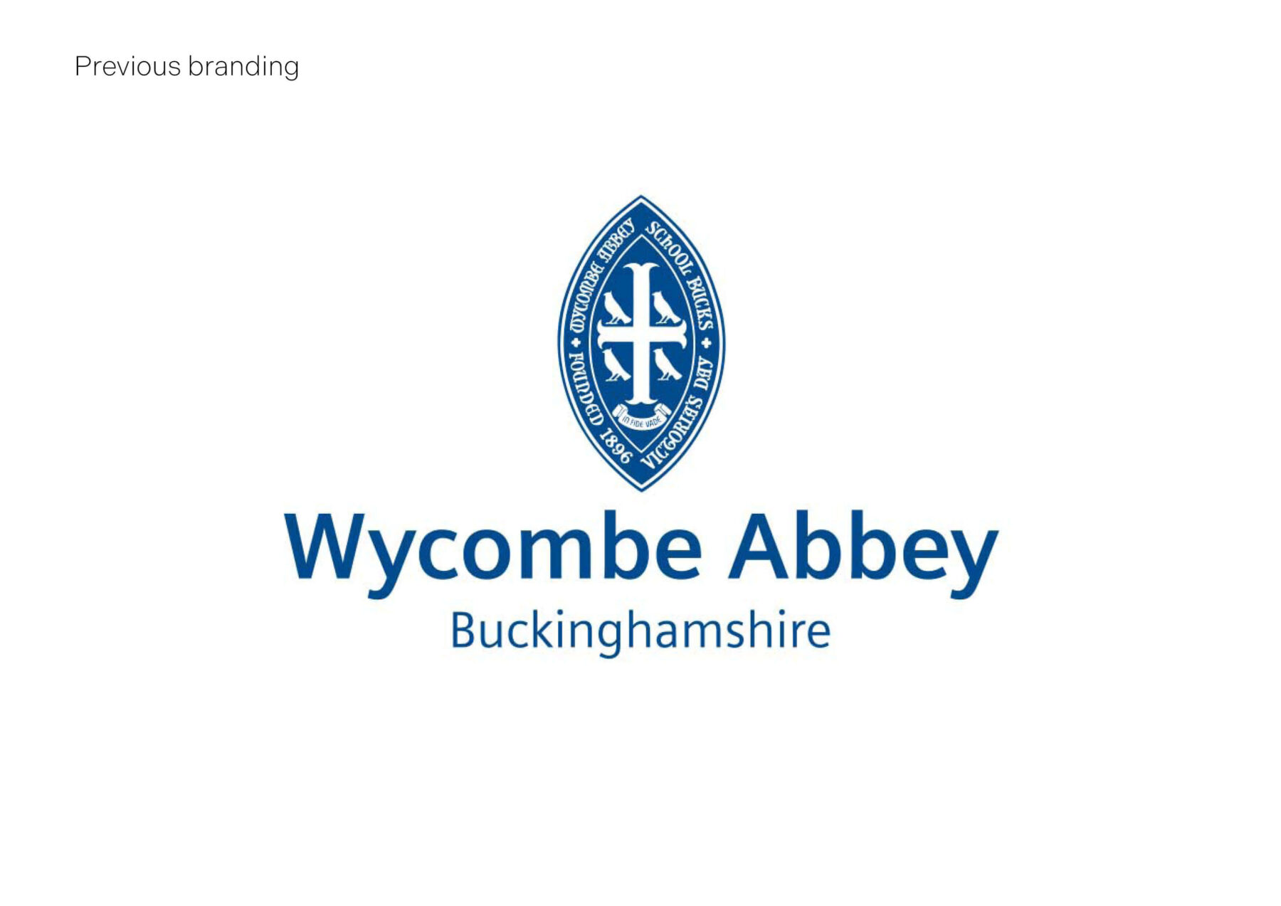
The school’s branding did not reflect this.

MONOGRAM was engaged to redefine the School’s brand essence and positioning followed by a brand refresh. A critical aspect of our brief was to reinvigorate and modernise this prestigious institution while respecting traditions—to create long-lasting cultural change that everyone in the School community feels proud and comfortable with. 
brand identity design

We began with a deep immersion and discovery phase with the purpose of highlighting where the current branding was falling short. Meeting with a number of pupils, teachers, staff and alumni helped us to get under the skin of the School’s culture, community, values, and aspirations.

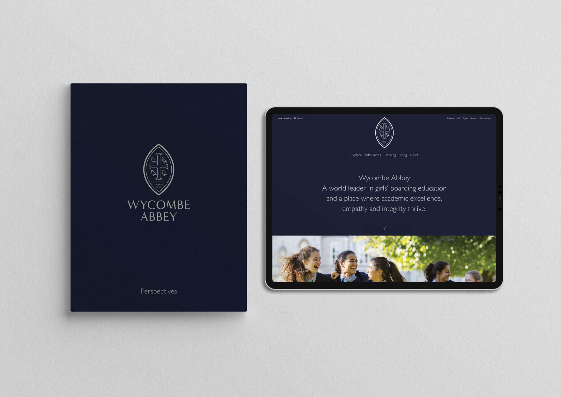
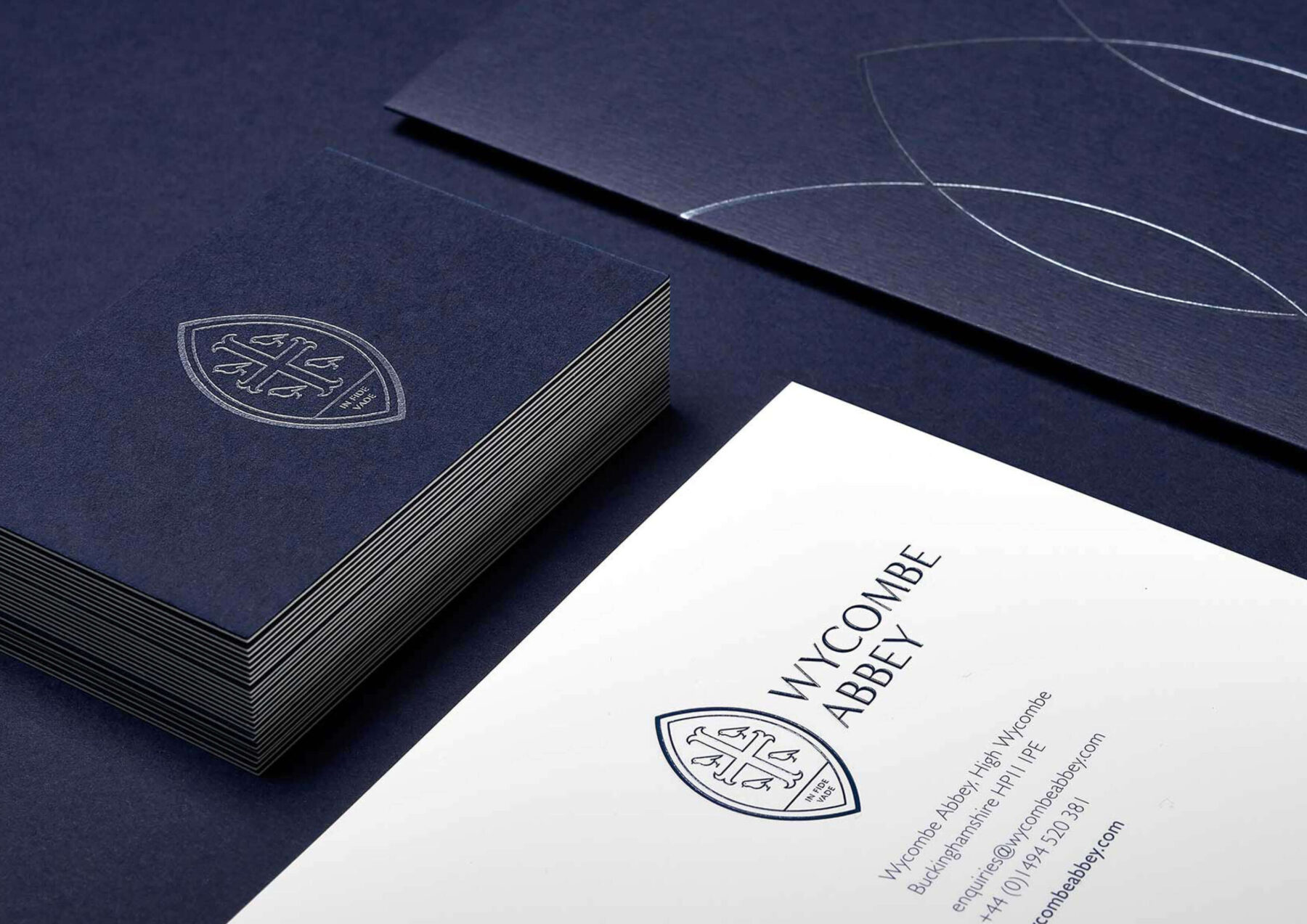
Our approach was to harness Wycombe Abbey’s treasured heritage in an accessible way. This started with a sensitive revision of the identity elements to reflect an offer that says World Class School. This was applied to every touchpoint with a clean, contemporary treatment and focus on premium materials reflective of a modern and pioneering world leader in education.

A clean, contemporary treatment and focus on premium materials reflective of a modern and pioneering world leader in education.

Our team completed a brand audit for the school which helped us explore every level of brand engagement.

website design and development

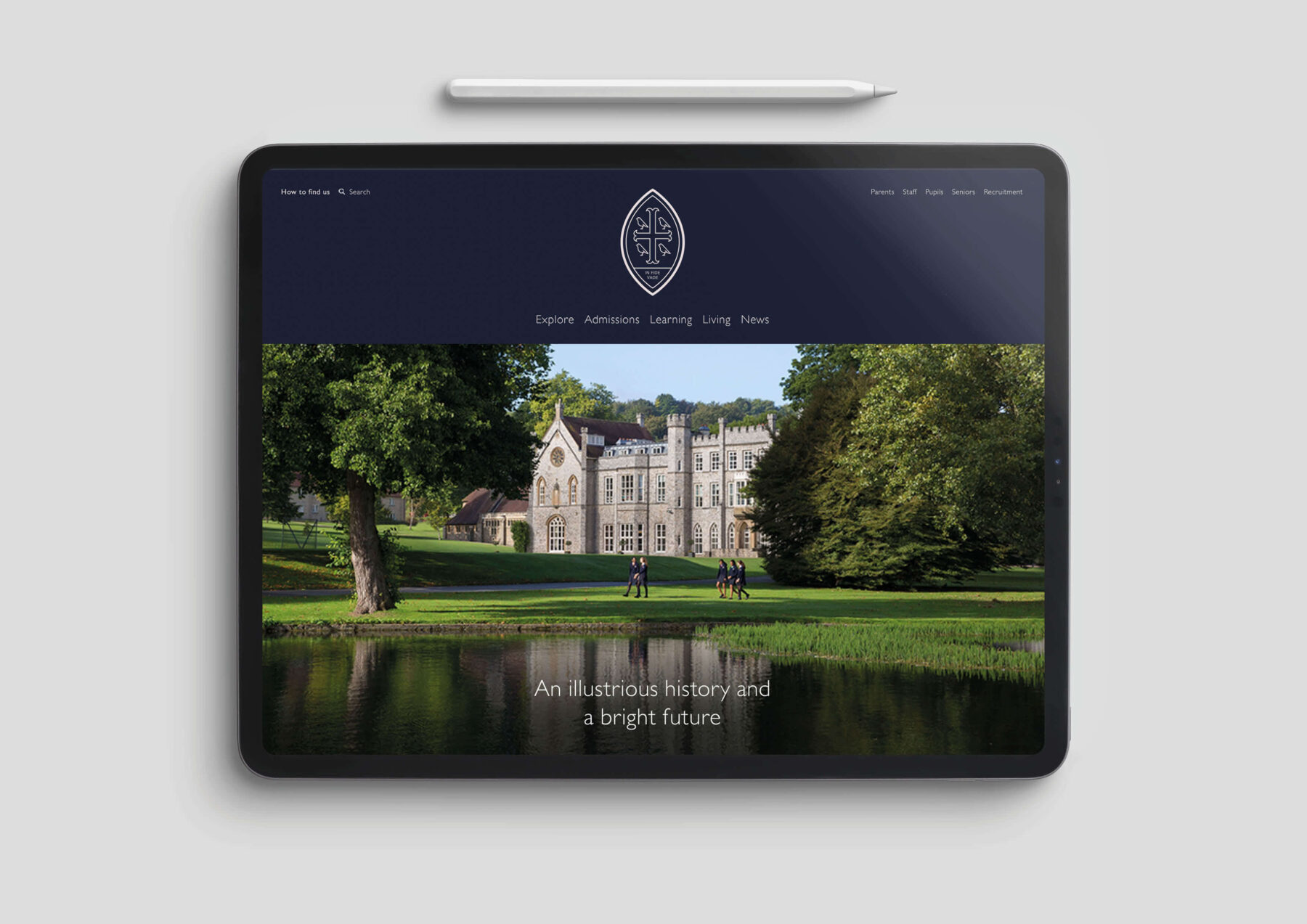
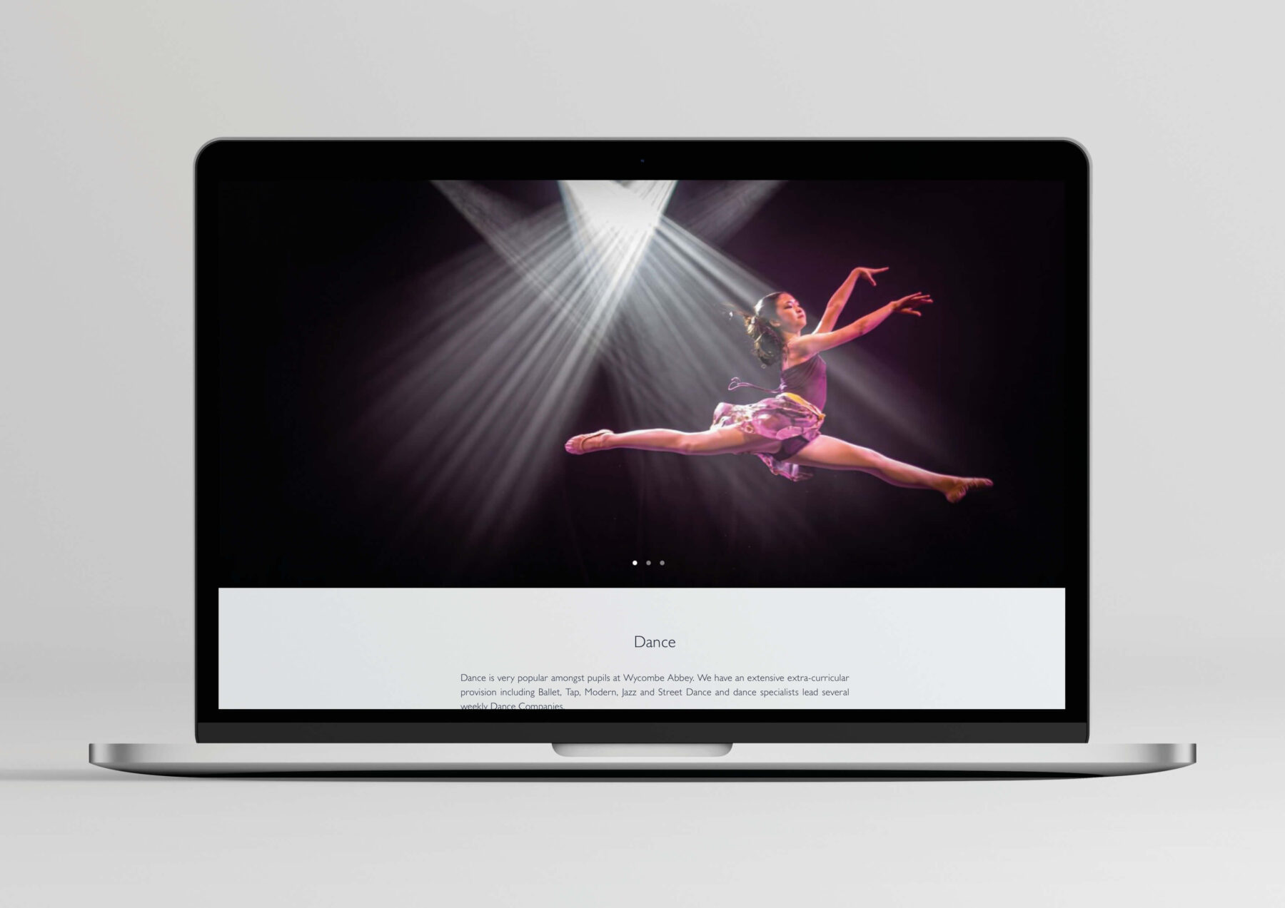
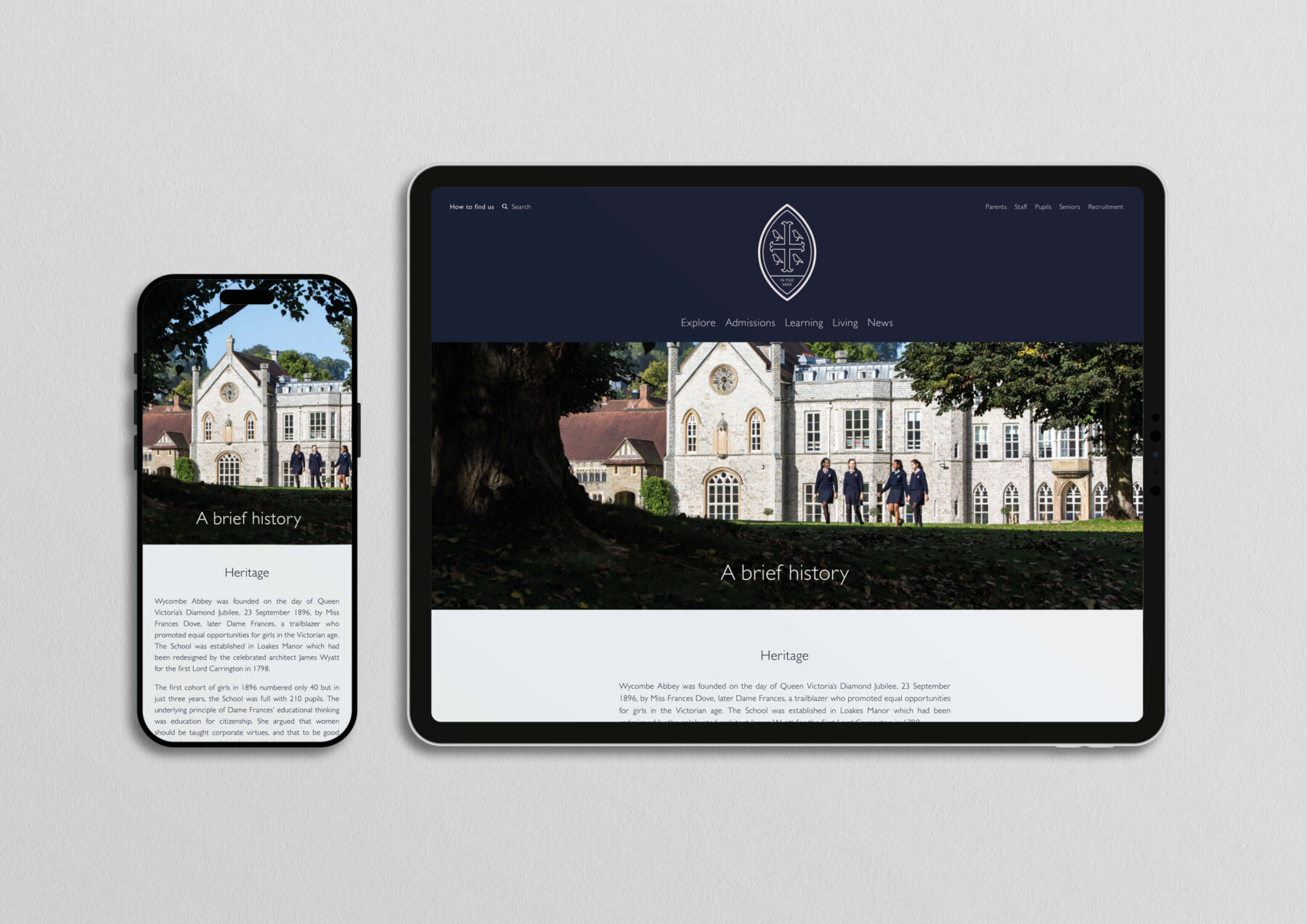
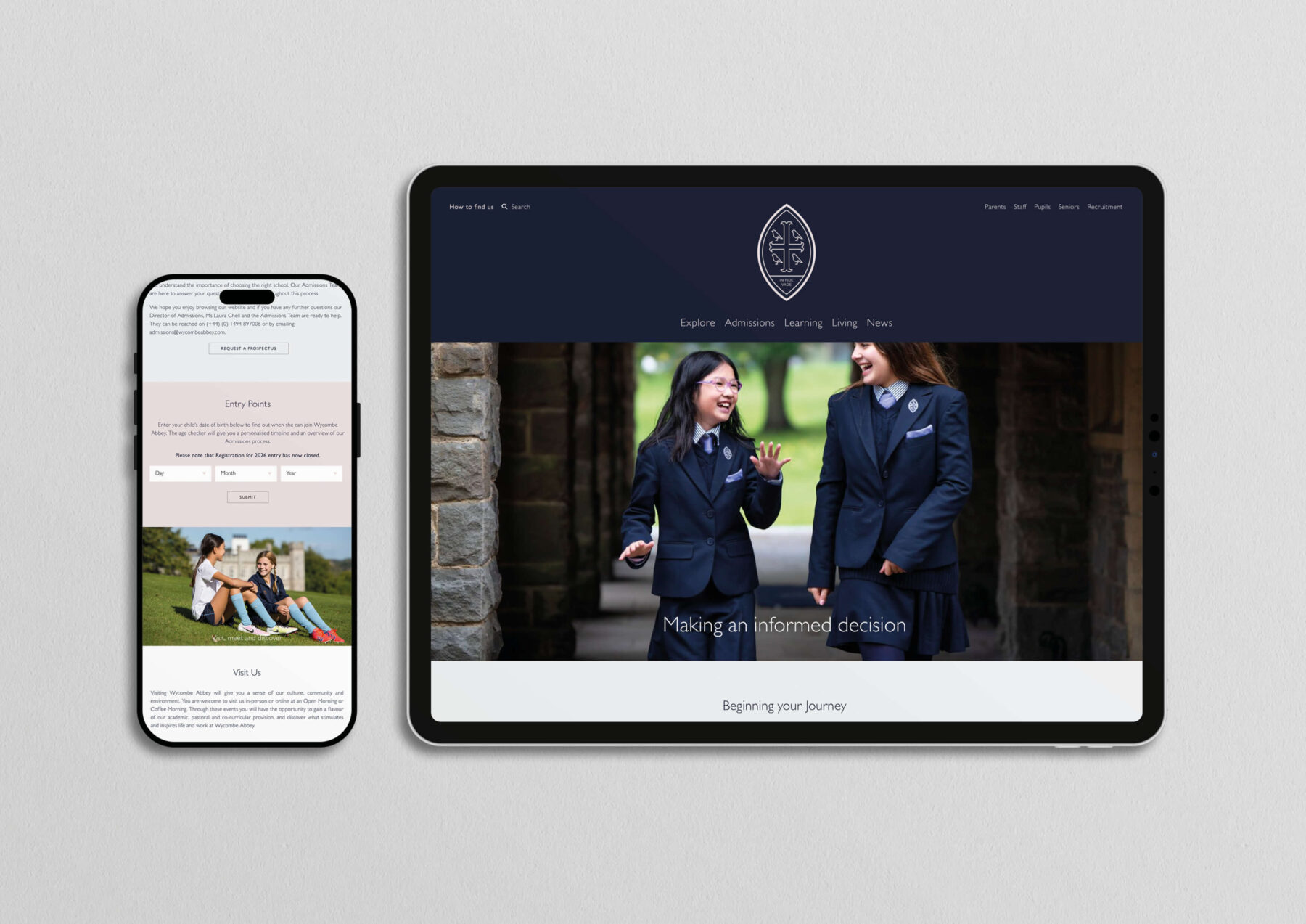
We designed and built the new website for the school. Our streamlined UX design makes a wealth of information easy to navigate along with a number of tools that help prospective parents plan for their child’s entry into the school. All audiences were catered for, including Parents, Staff, Pupils and Alumni.

‘It’s been five years since we launched the new website and yet we still regularly receive overwhelmingly positive feedback and gratitude from prospective parents on how well designed and user-friendly our website is, especially when compared to others. Typically we would be due for a review of our website now, but there’s simply no need.’ – Executive Assistant to Head of Communications

prospectus design

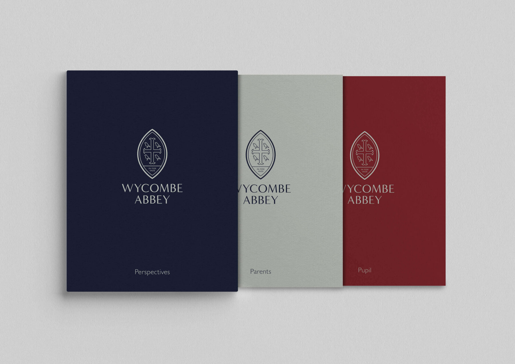
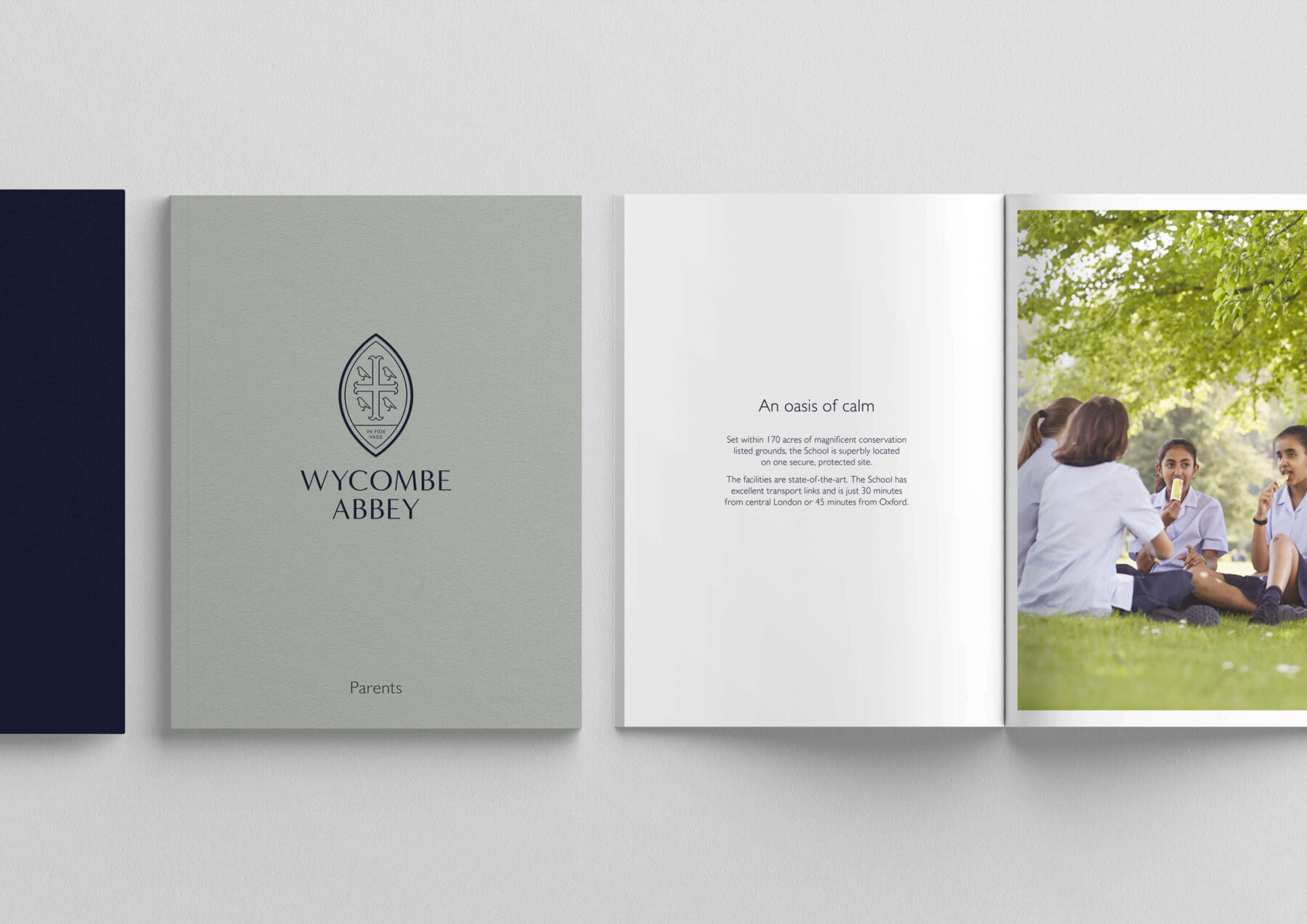
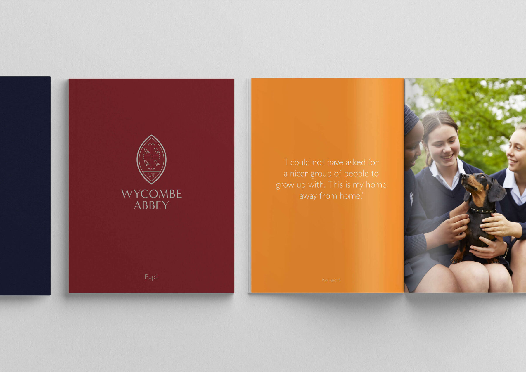
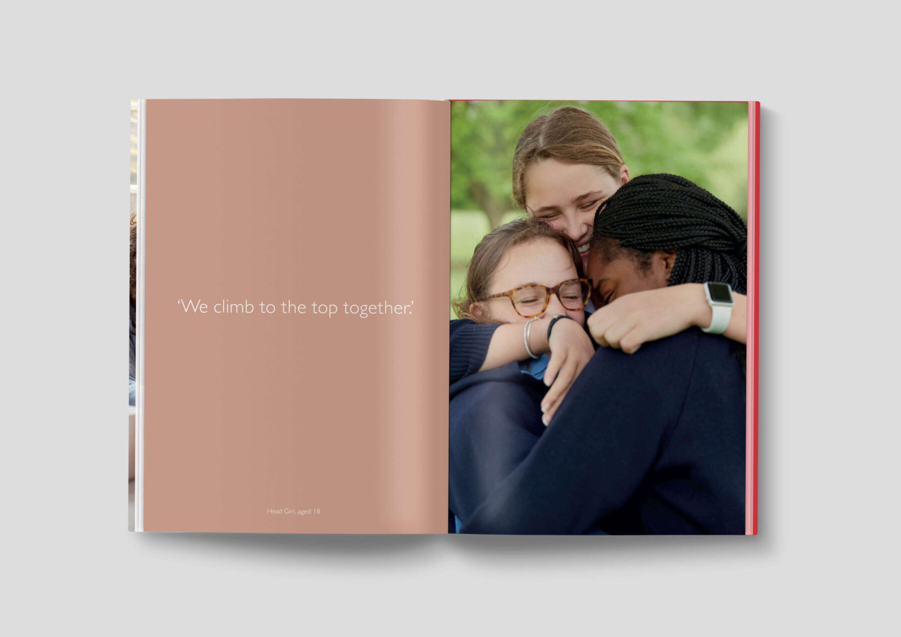
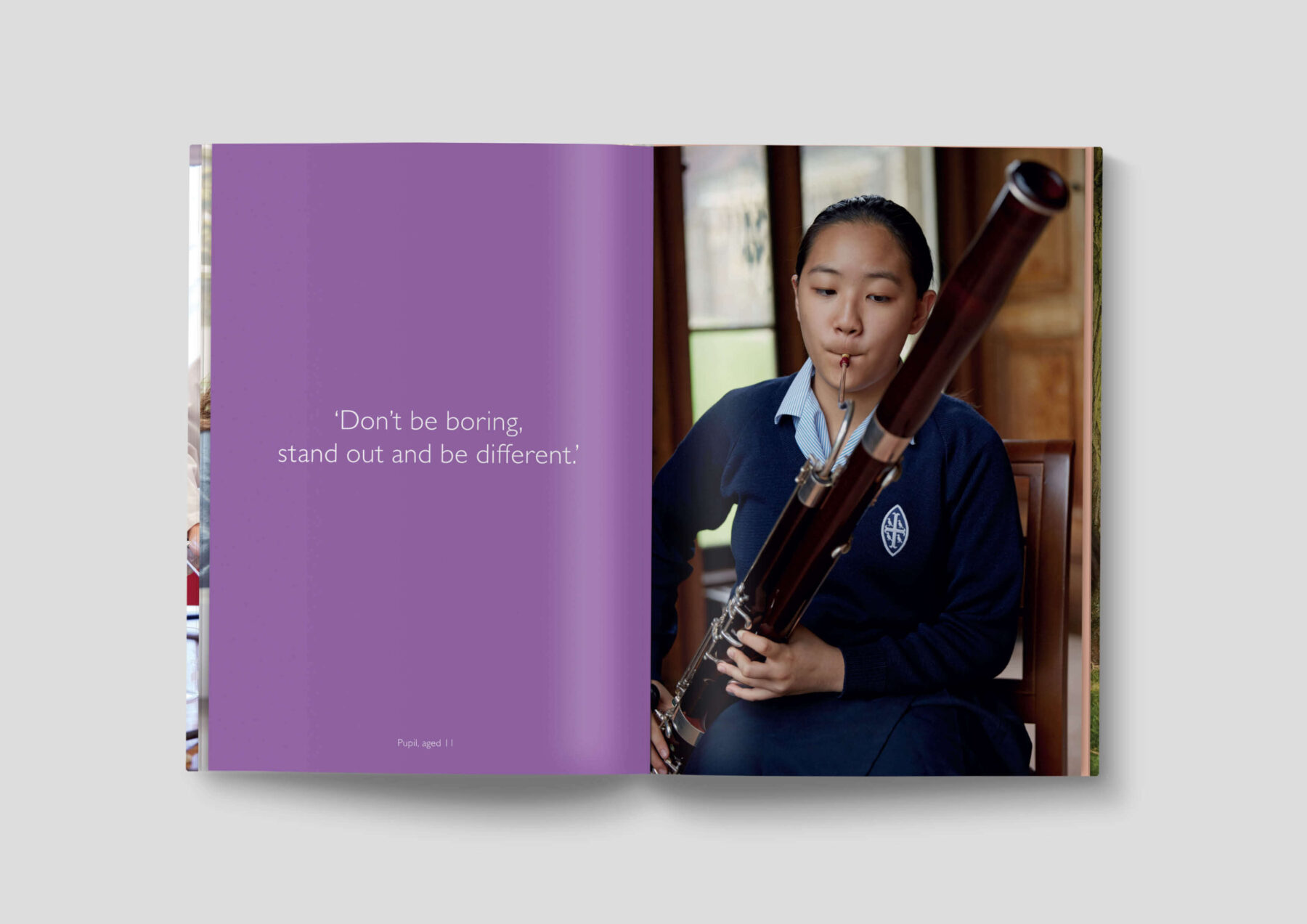
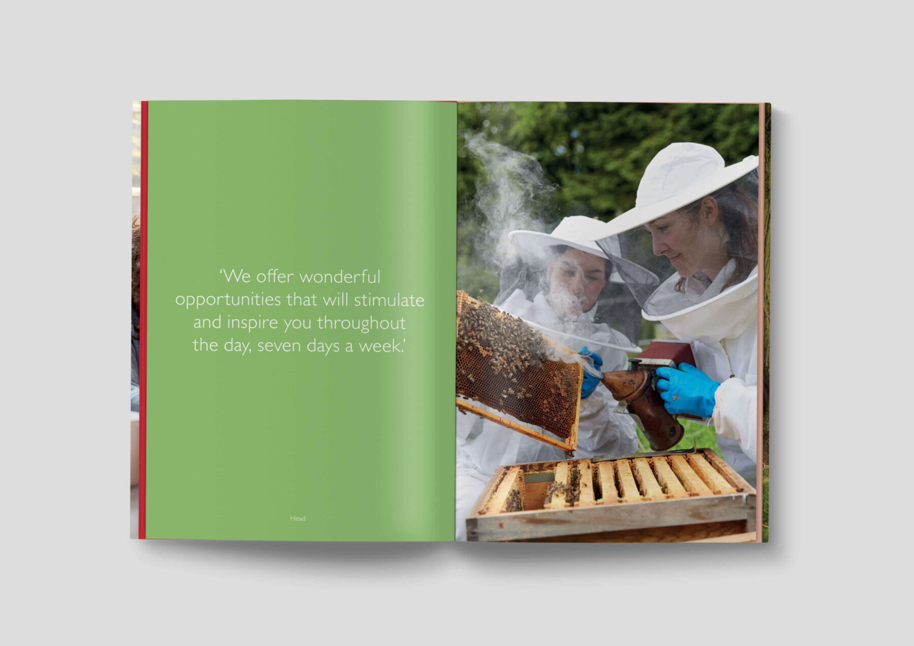
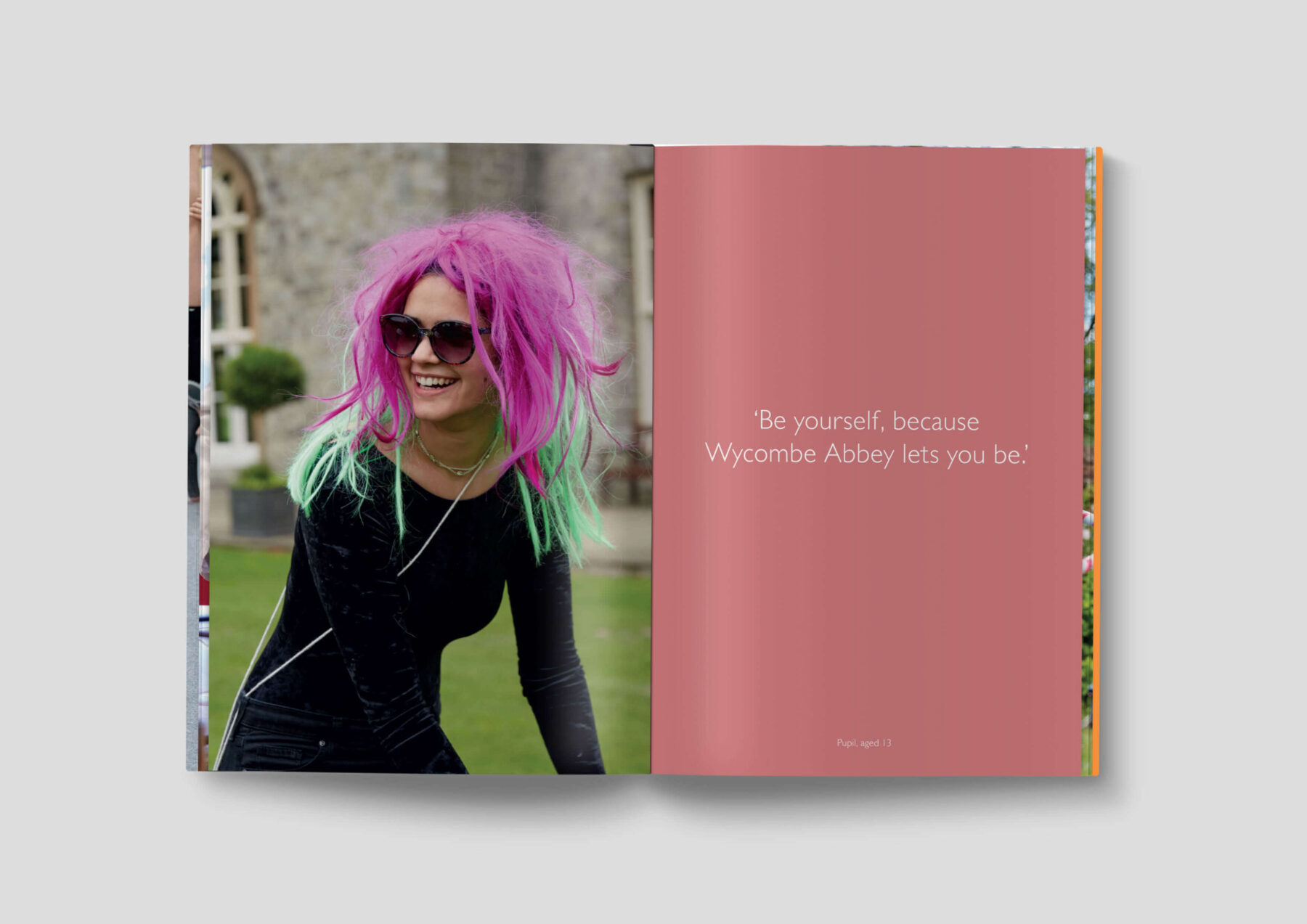
Our concept for the school’s prospectus was unlike any other. We created one book for the parents and one for the pupils—each completely different to the other in terms of design, content and tone of voice—allowing the prospectus to cater and appeal to each mindset.

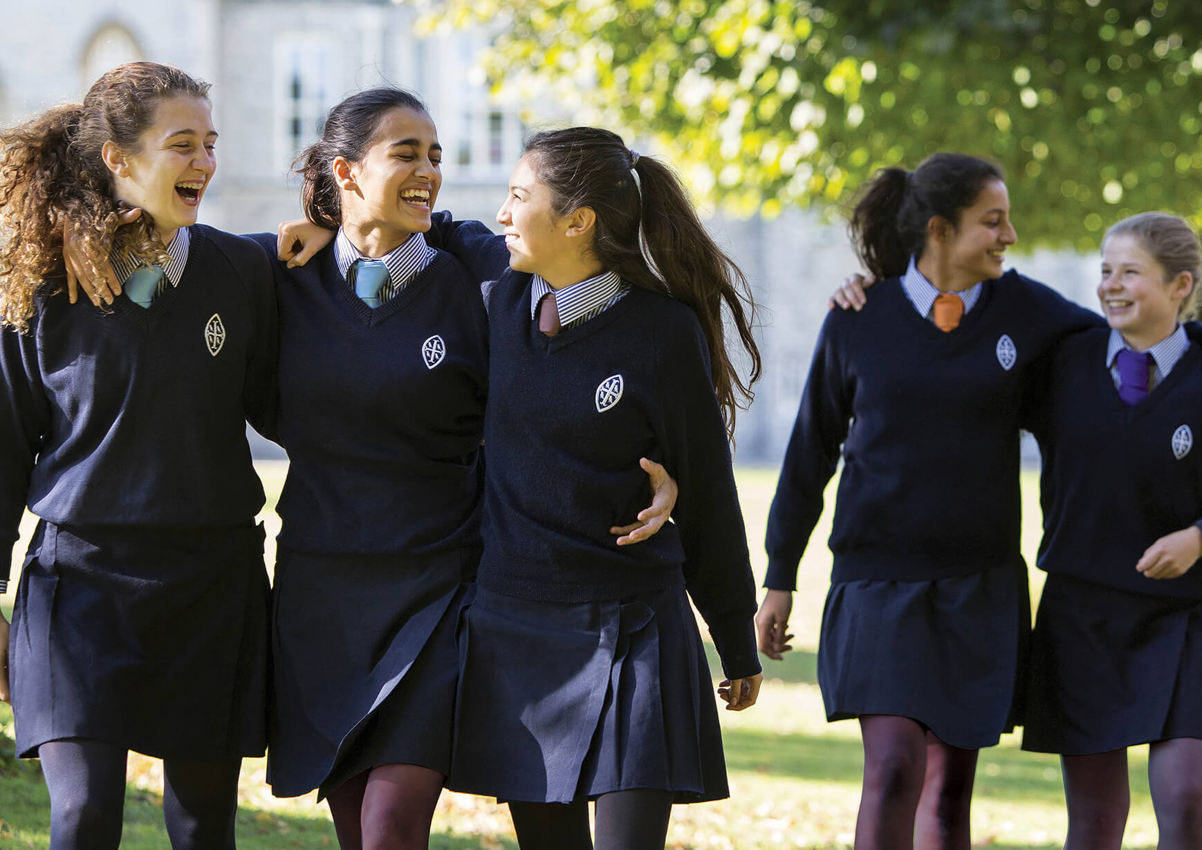
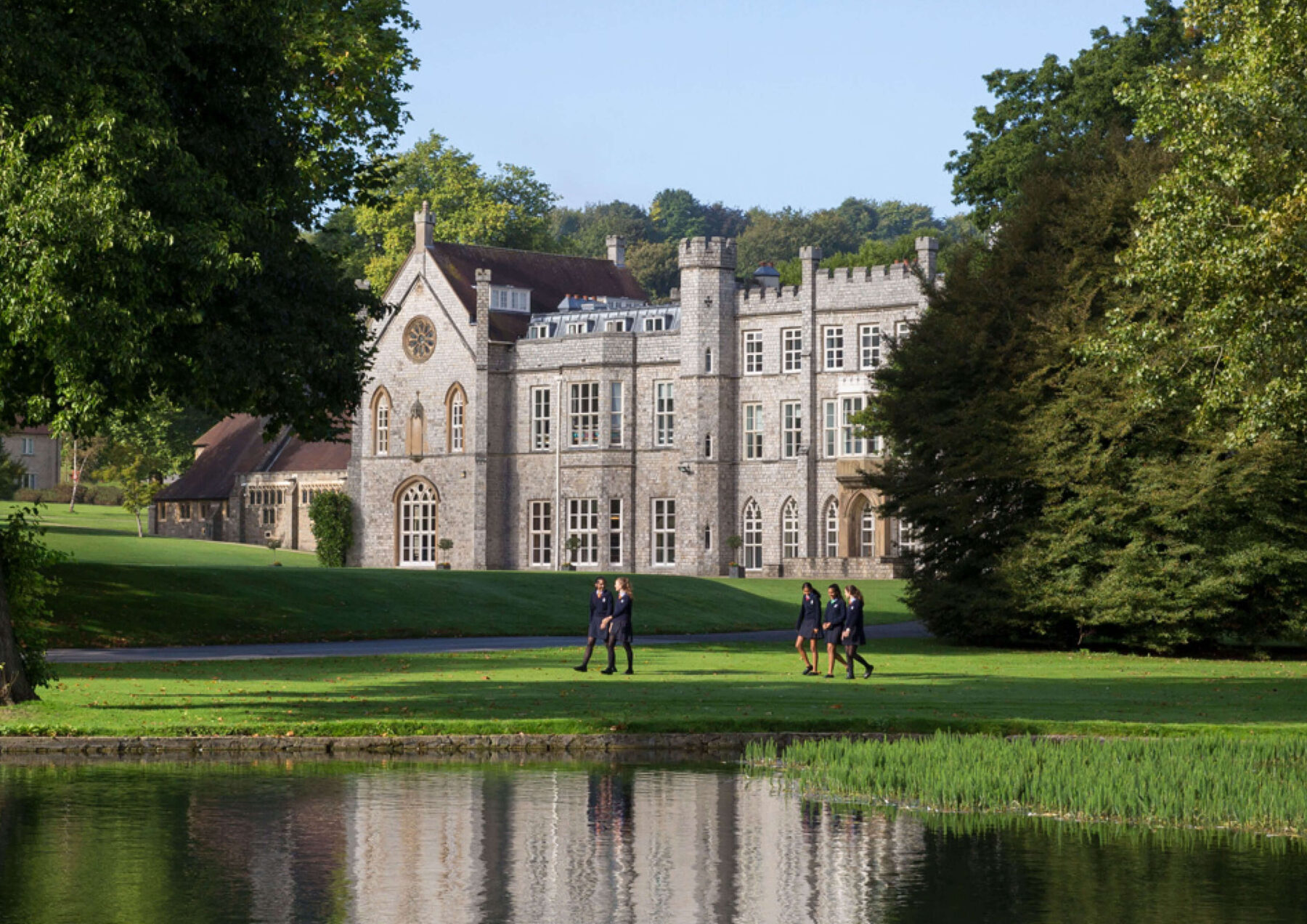
Our photography captures the school spirit in a genuine, beautiful and engaging way.

house branding

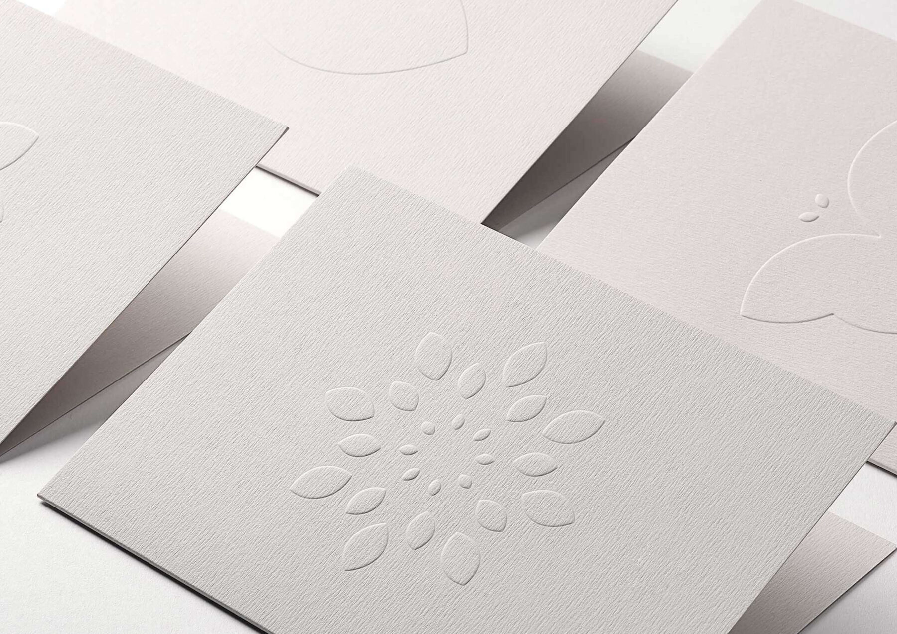
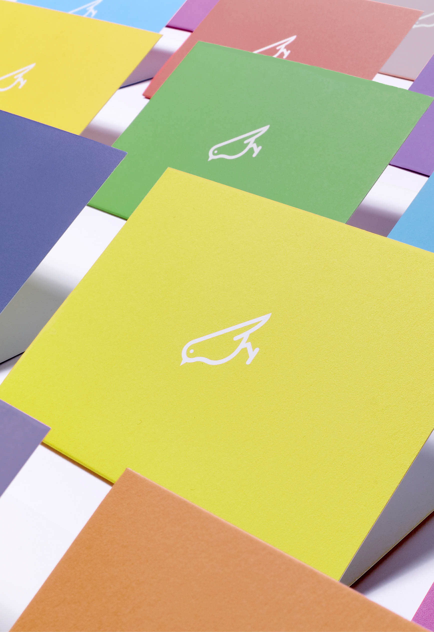
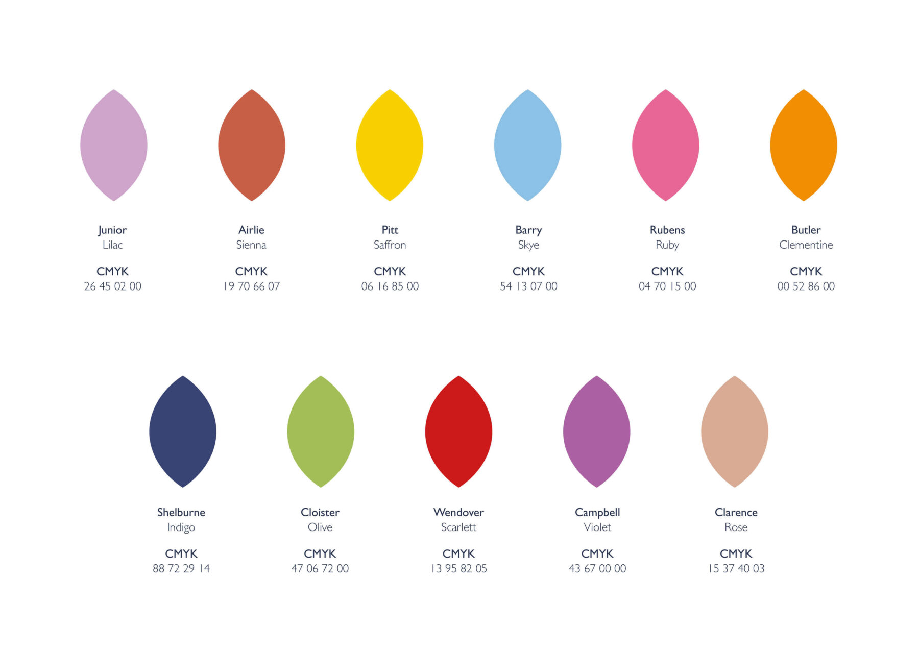
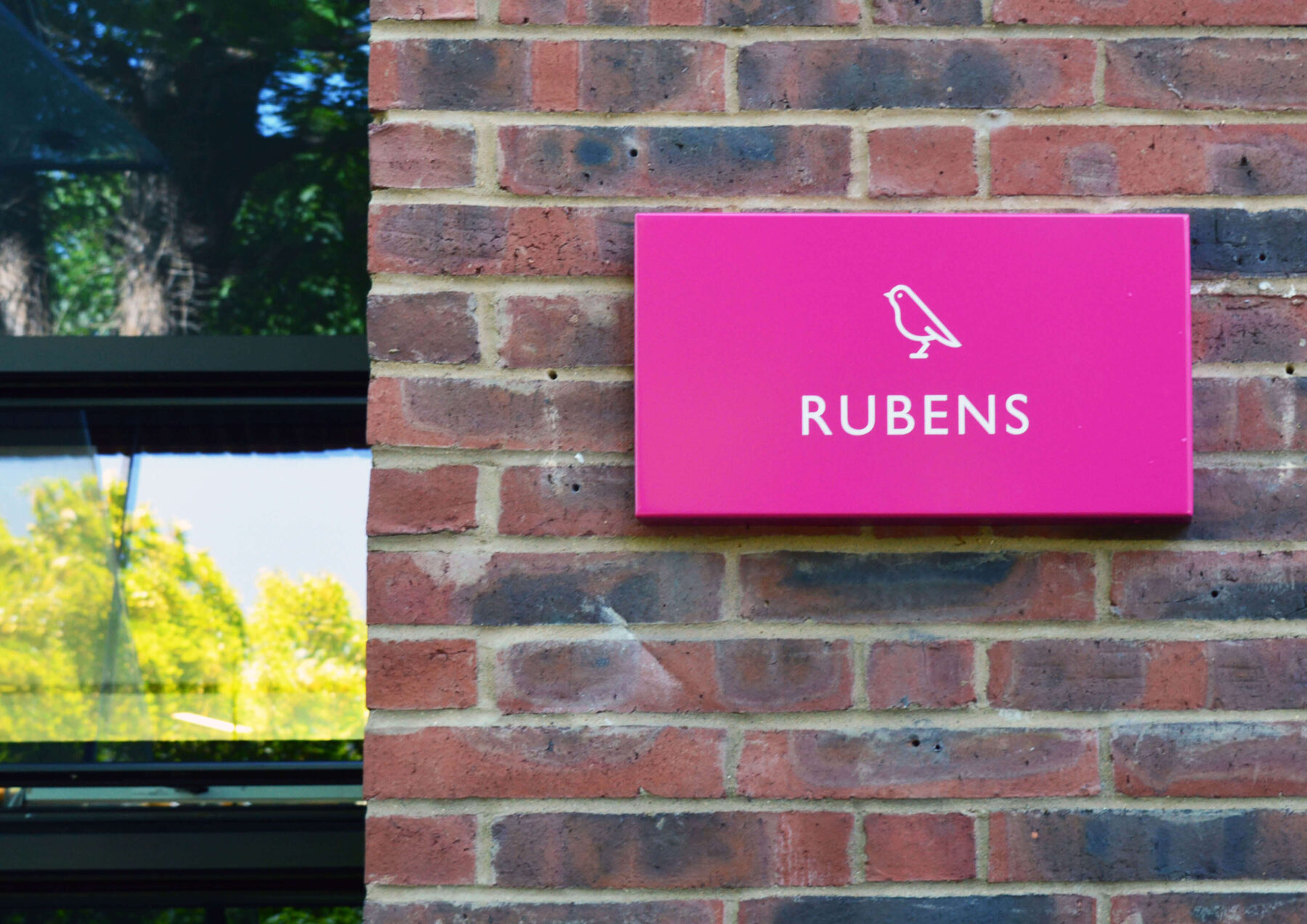
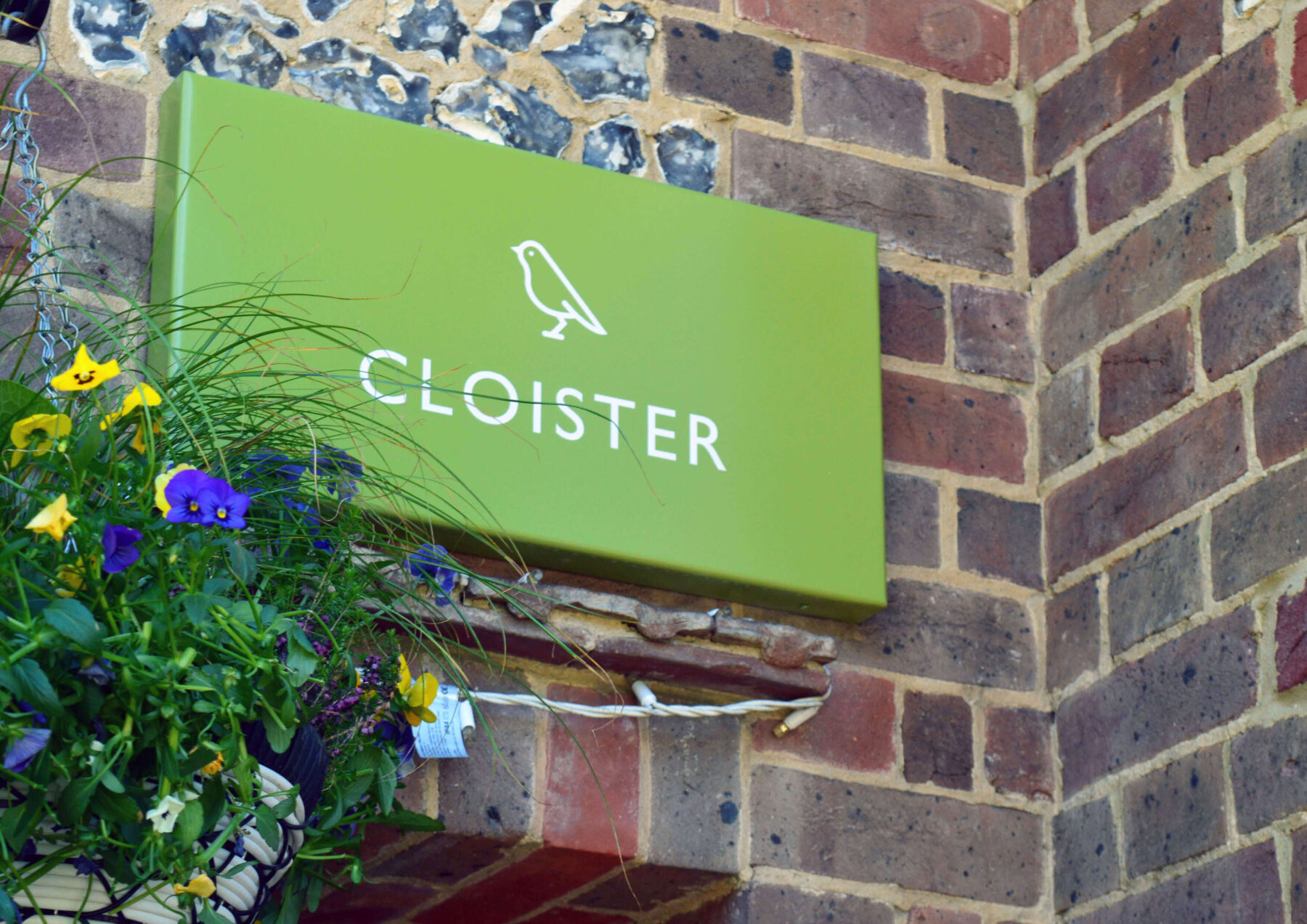
Each of the 11 boarding houses at the school were assigned a colour, which was used throughout a range of house communications from parent note cards to signage and uniform accessories.

International Schools

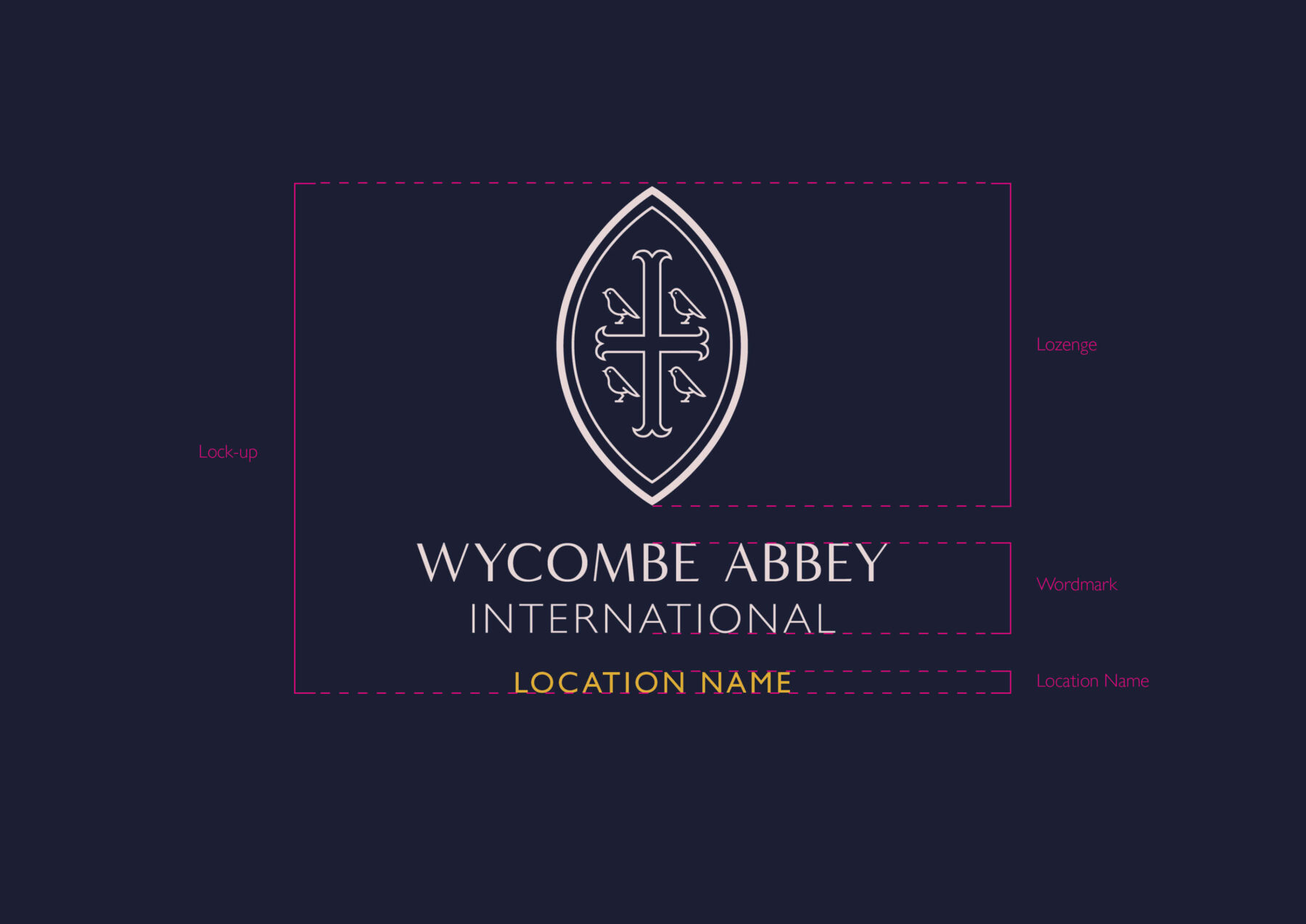
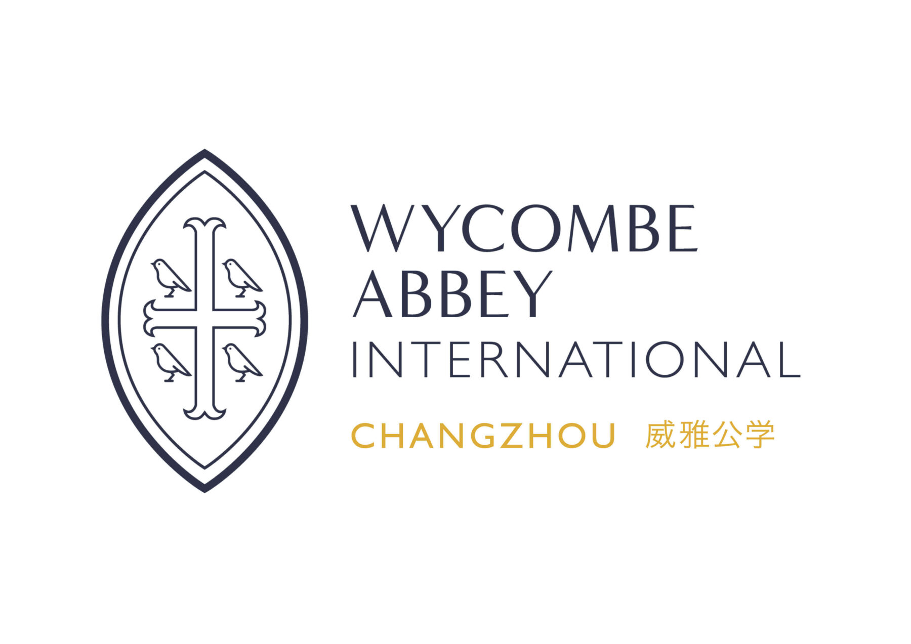
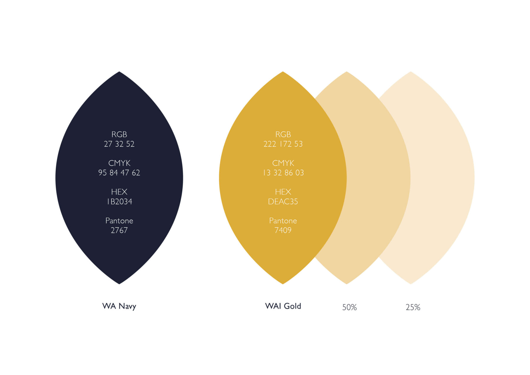
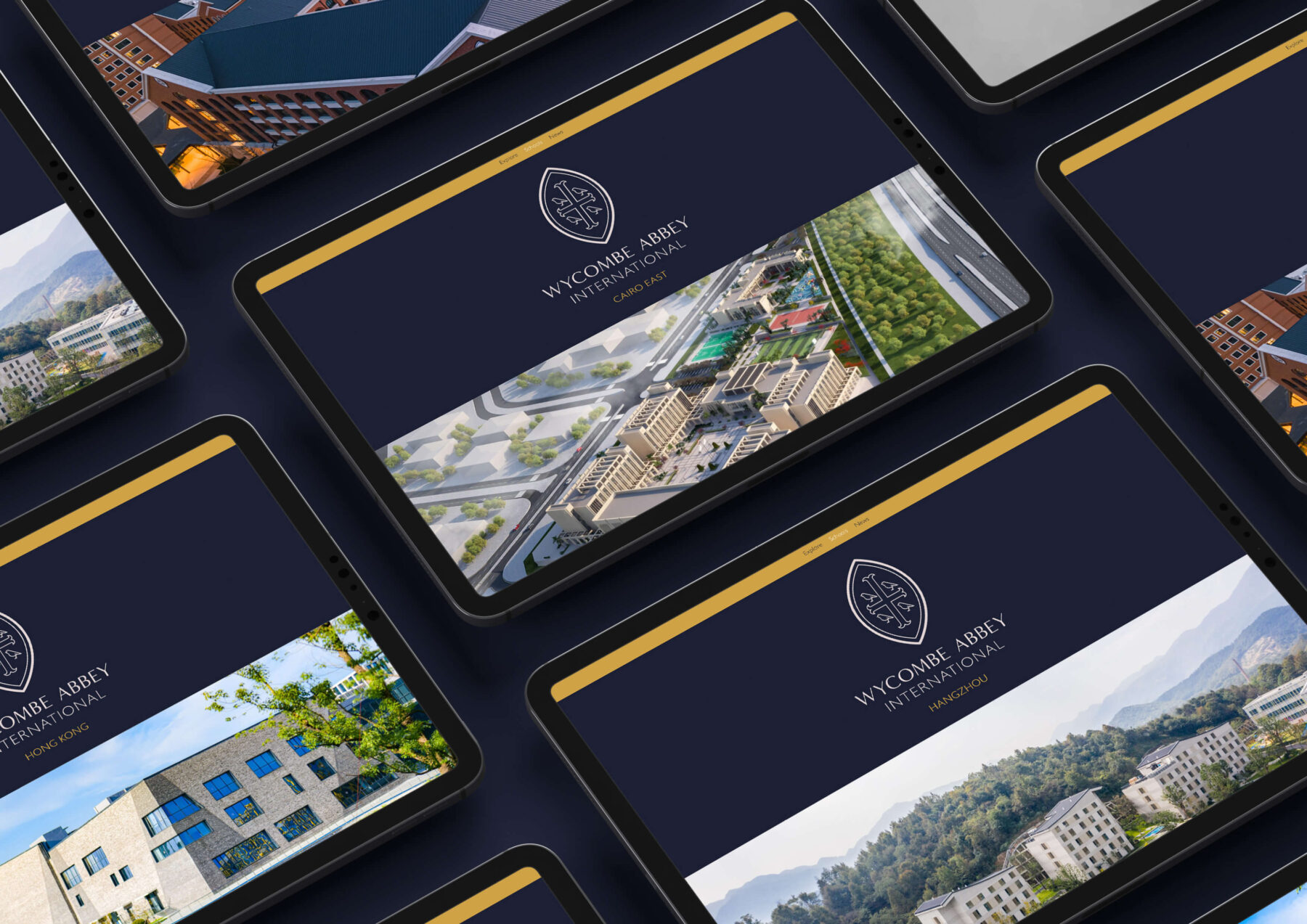
A new brand identity system and guidelines was also created for Wycombe Abbey International Schools, which echoes the master brand albeit with some modifications to help it differentiate.