Laura and Emily Smith are the sister-and-sister founders of Molten 1090, a British luxury homeware brand specialising in designing and making captivating sustainable handblown glass tableware, lighting, accessories and bespoke pieces. They run the company side-by-side from their East London studio—by way of Bermuda, where the two were born and bred. They commissioned MONOGRAM to bring their vision for an artisan handblown glass brand to life through conceiving a name then creating a brand identity, packaging, Creative and Editorial Direction
Captivating handblown glassware made in East London by way of Bermuda

naming and brand identity
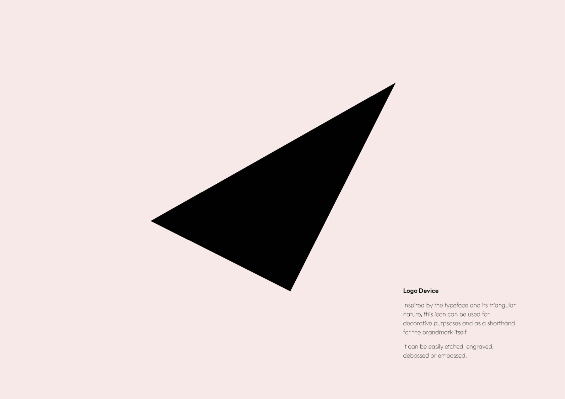
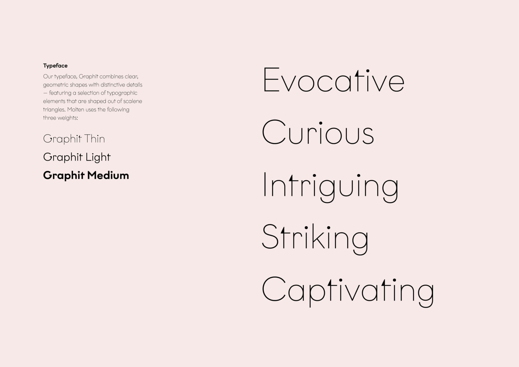
In glassblowing ‘molten’ refers to the state of glass when it is heated to a very high temperature, in this instance, 1090 is Laura’s preferred temperature to blow the products – hence the name Molten 1090. MONOGRAM conceived a brandmark using the typeface Graphit which combines clear, geometric shapes with distinctive details – a nod to the ‘fleck’ details in the product range. The logo device is inspired by the typeface and its triangular nature; an icon that is used for decorative purposes as a shorthand for the brand.
packaging design
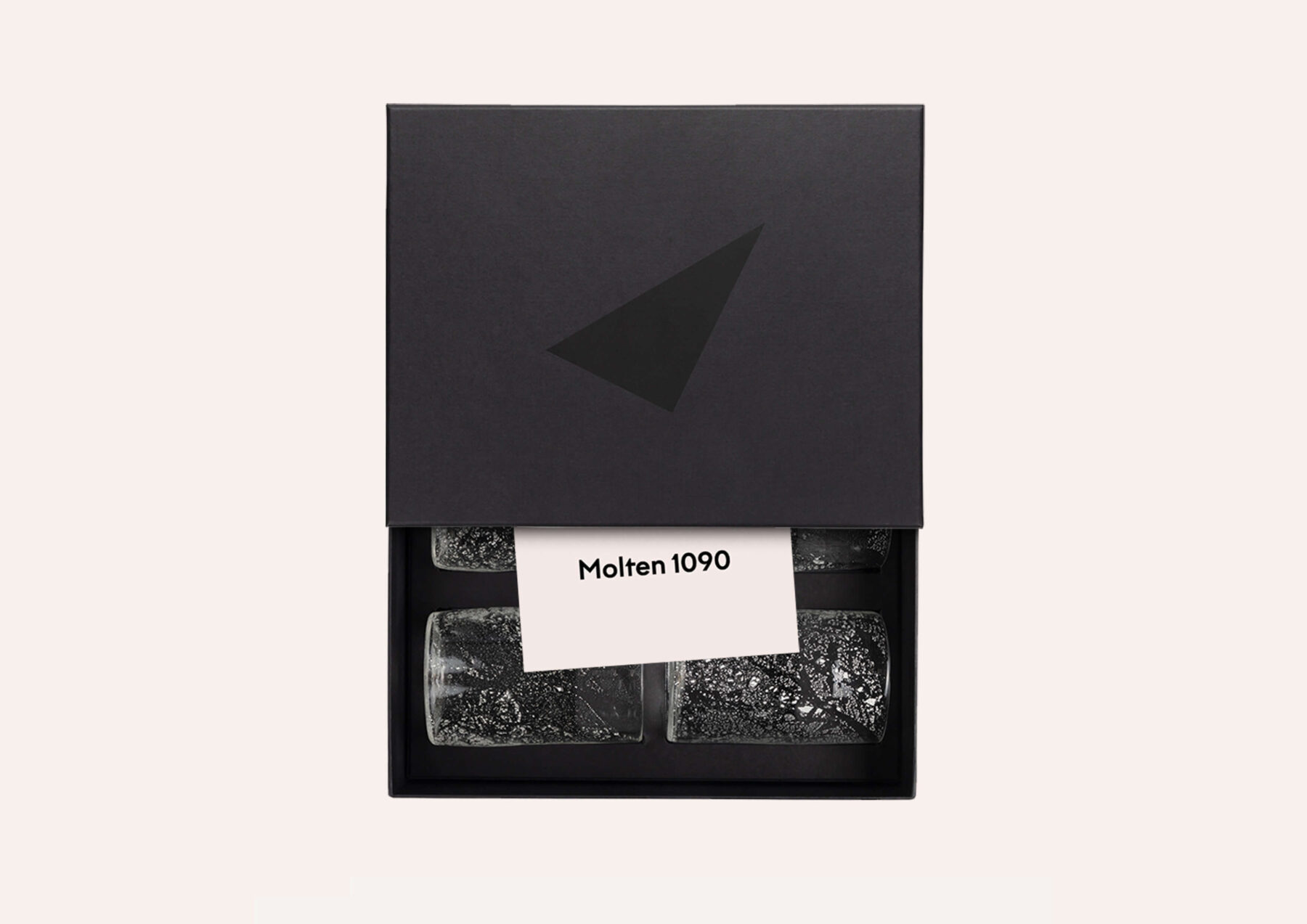
We designed the packaging for Molten 1090 to reflect the brand’s refined yet elemental identity. The materials and finishes were chosen to echo the tactile nature of handblown glass—clean, minimal, and considered. The brand icon features as a decorative motif to reinforce brand recognition while adding a distinctive, crafted feel to enhance the sense of quality and uniqueness of each piece; while the packaging structure ensures both protection and an elevated unboxing experience.
creative direction
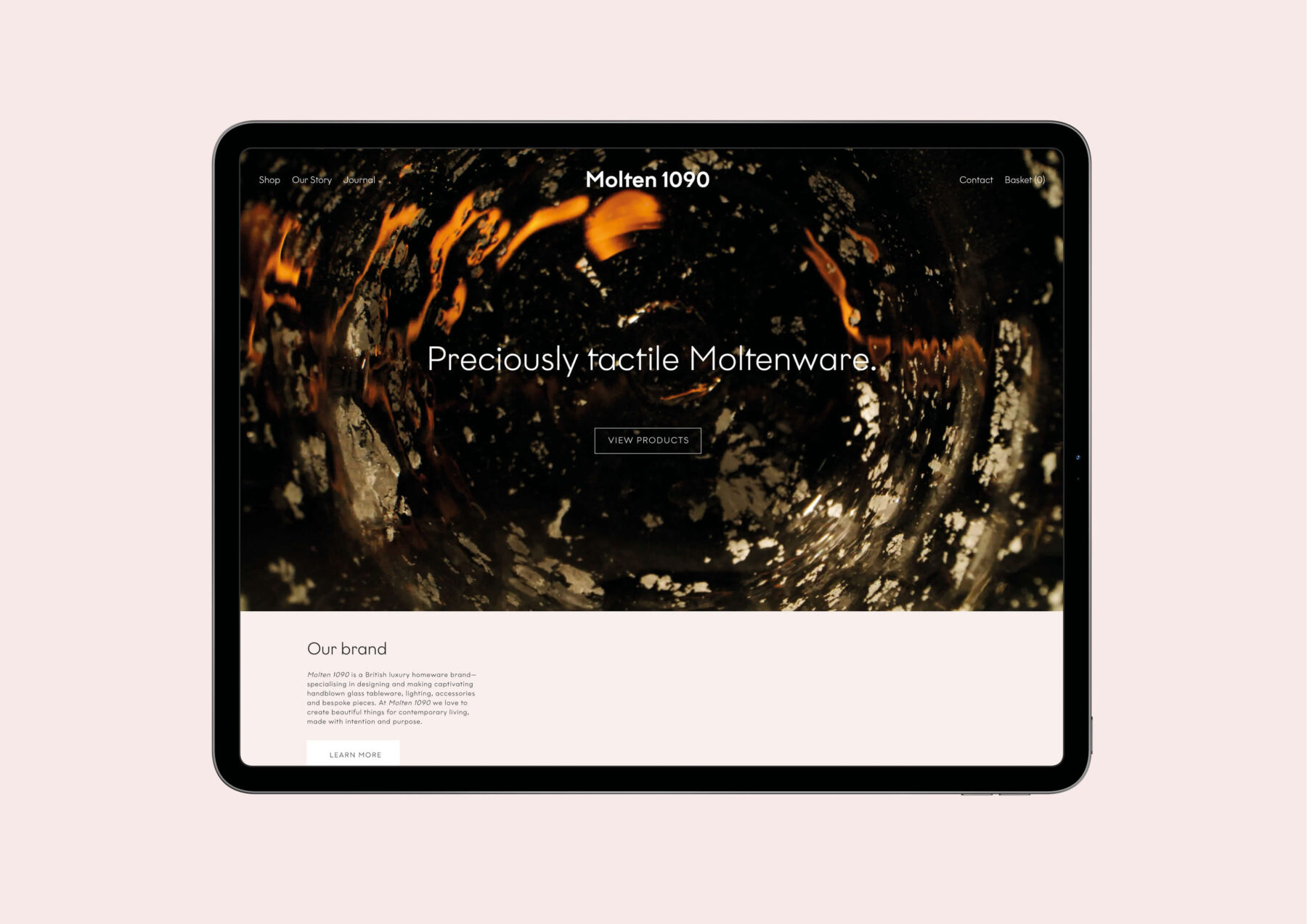
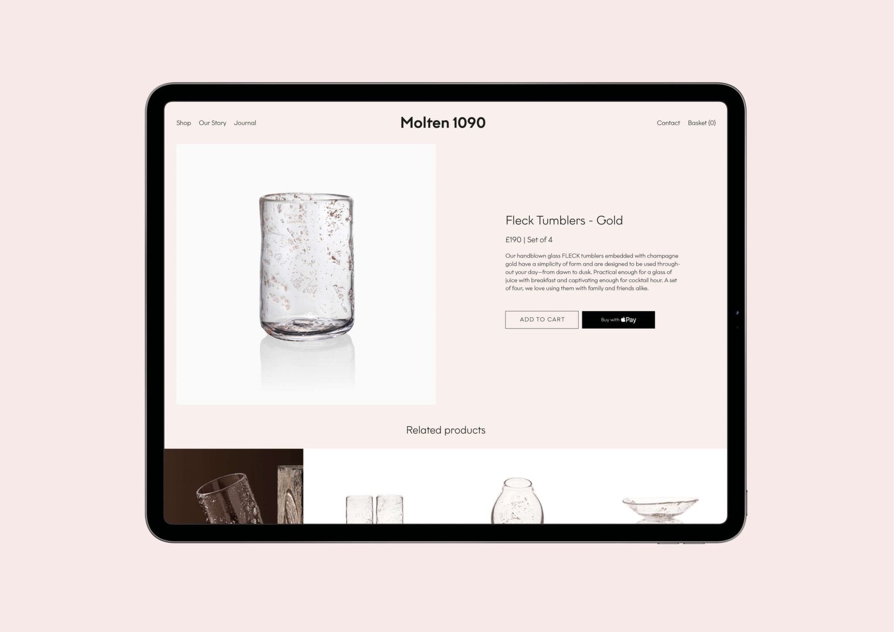
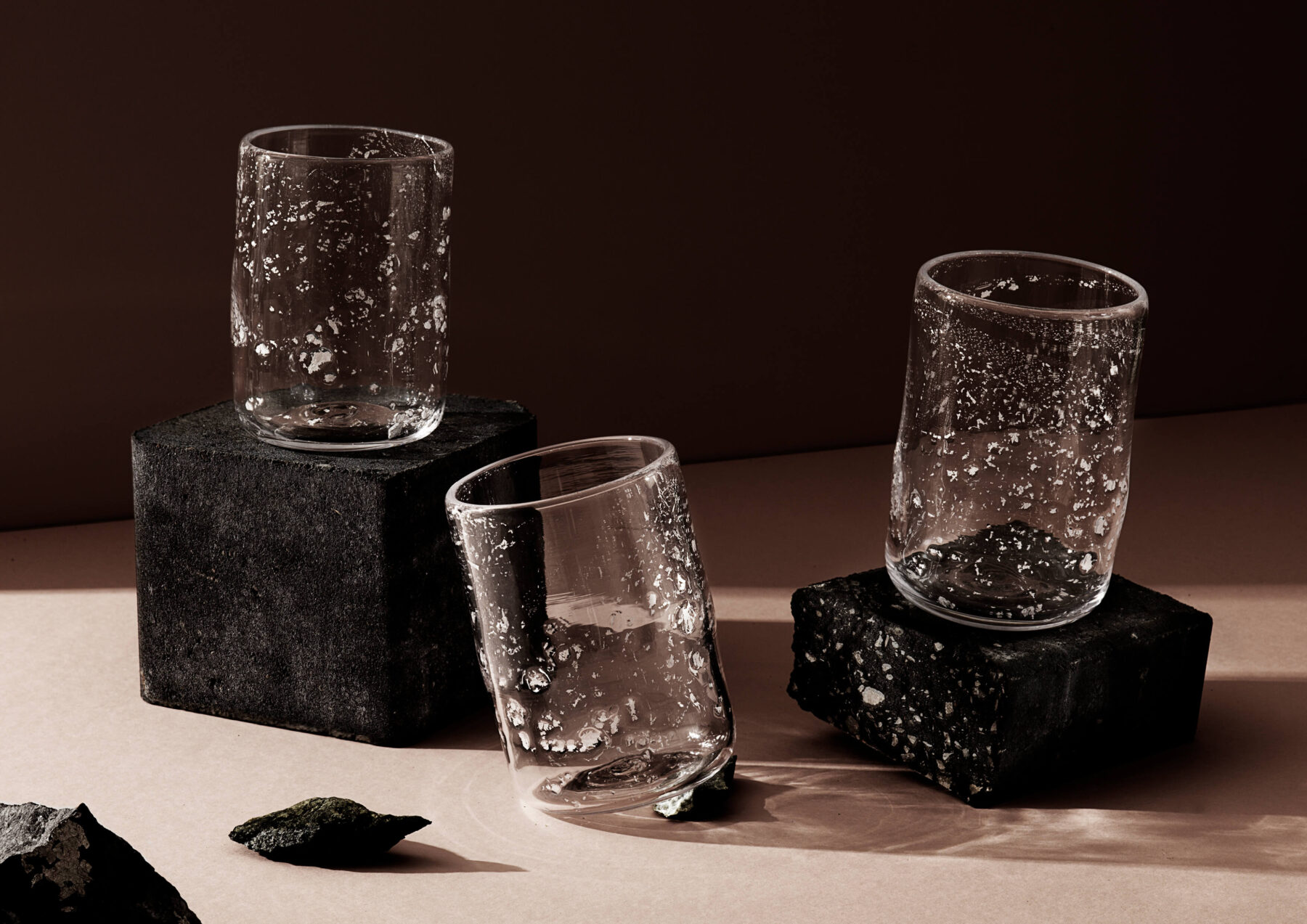
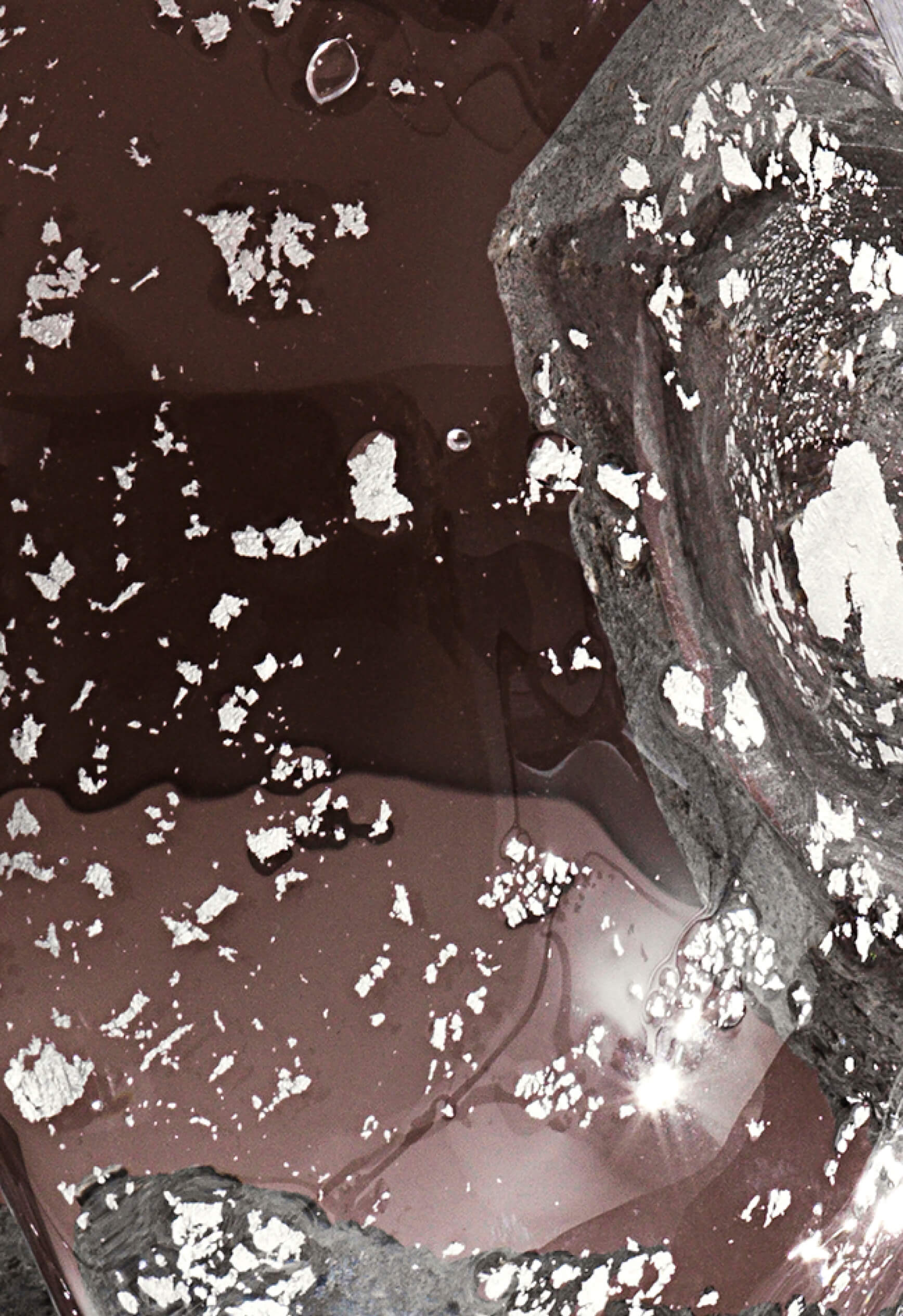
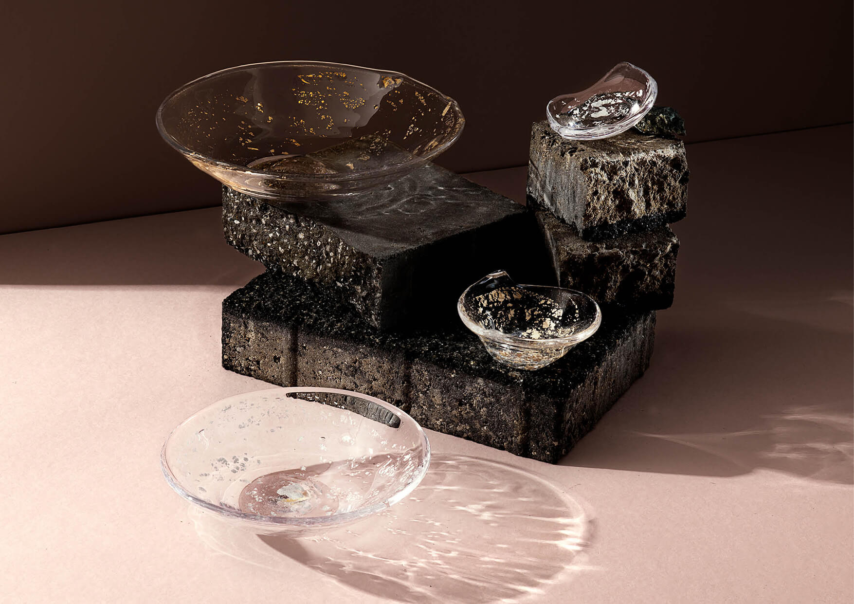
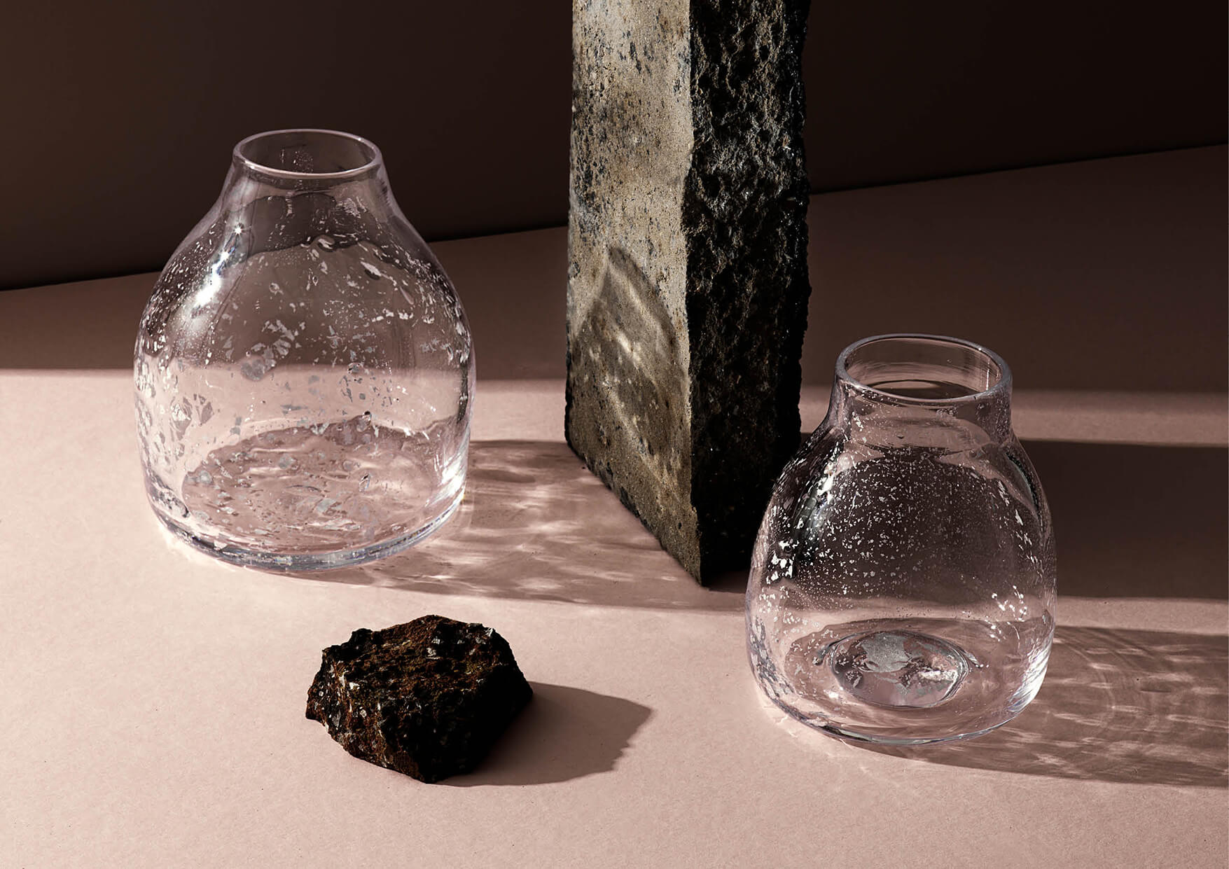
MONOGRAM led the creative direction for Molten 1090’s digital presence and photography, ensuring every visual touchpoint communicated the brand’s craftsmanship. From art direction to styling, the imagery captures the fluidity, texture, and glow of molten glass, while the digital design translates this warmth into a contemporary user experience. The result is a cohesive visual language that elevates the brand both online and in imagery.
editorial direction
We also defined the editorial direction for Molten 1090’s online journal, and crafted a distinctive tone of voice and style guide. The content approach balances technical insight, with storytelling, and particularly around driving a considered-by-design practice which places circular design and producing locally in the UK at the heart of the brand.